
For years, the formula was simple: whitewalls, gray cabinetry, and just enough contrast to keep things interesting. But after more than a decade of cool tones dominating interior design, homeowners are beginning to crave something different.
Color, after all, is in constant evolution. Trends come and go. Homeowner preferences ebb and flow. What may have been the defining color of one era can quickly be labeled outdated, drab, or overdone in the next.
Take a trip back to the ’50s, when pastel hues adorned everything from bathroom tile to kitchen appliances. Then came the earthy golds and oranges of the ’70s, followed by the jewel tones and dramatic prints of the ’80s and ’90s. Fast-forward to the last decade, when a more pared-back approach to color dominated interiors. But now, color is making a comeback—not as a passing trend but as a reflection of homeowners’ desire for spaces that feel personal and lived in.
Here, designers and color experts weigh in on the shades, palettes, and applications defining today’s homes—and how to balance boldness with timeless appeal.
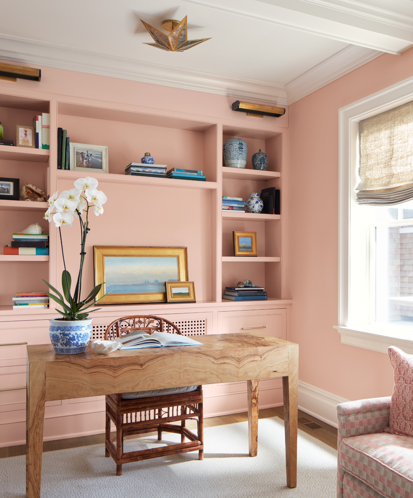
Across the industry, experts are seeing a clear shift toward warmth. Kari Campbell, founder and creative director of her eponymous interior design firm, sees people gravitating toward earthy, grounded palettes—think warm taupes, deep greens, and “richer paint colors that feel more organic,” she says.
Danielle Stallings, residential design account executive at Sherwin Williams Company, notes a similar trend toward complex neutrals. “These colors tend to have a visible undertone and are greatly impacted by lighting and additional materials and finishes in the space,” she says. Khaki, for example, may appear tan at first glance but often reveals hints of gold or green when you look a little deeper.
While Wendy Doornink, color services manager at Hirshfield’s, agrees that warm neutrals are leading the charge among today’s color trends, she also notes the popularity of anchoring hues like navy, green, and deep brown-influenced grays—not to be confused with the cool grays of year’s past, which all three experts agree have been phased out of the color conversation.
“Light cool grays and all-white kitchens have had a long run, but they now feel dated,” Campbell shares. “Walls, cabinetry, tile, and furnishings in deeper, more saturated colors are making our homes feel more inviting.” For Midwestern homeowners, those warmer tones offer another benefit: They help counteract the region’s long, cold winters.
Despite the growing popularity of color, many homeowners still approach it with caution. According to Campbell, clients are most willing to embrace color through paint. “It’s the lowest-commitment way to make a dramatic statement, and clients seem to know that,” she says. “We’re getting more requests for moody, saturated walls in spaces where someone might have played it safe by default a few years ago.”
Stallings believes this shift reflects a growing desire for self-expression in interiors. Homeowners want their spaces to feel unique, and color offers one of the most effective ways to accomplish that. It can also influence how a room feels. For instance, recent research has shown that darker colors can create a “cocooning” effect, particularly in bedrooms, dens, and other spaces intended for rest and retreat, Stallings says.
For Doornink, many of today’s bolder color choices also evoke a sense of nostalgia.“Going bold or dramatic is a risk,” she says. “Many older homeowners look atnew hues through the lens of their former popularity and want to avoid tonesthat feel dated.” For instance, a soft blush might evoke memories of 1990s mauve. A warm brown may prompt flashbacks of heavy wood paneling from years past.
However, nostalgia works both ways. Colors associated with a happy childhood memory or a grandparent’s home can feel comforting rather than outdated. The difference comes down to context and execution.
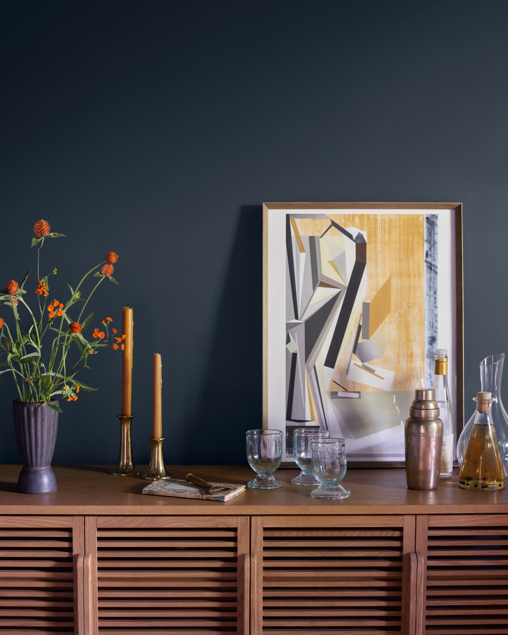
For homeowners who are ready to embrace the drama of color, texture and sheen are crucial considerations. As Doornink explains, “Texture provides shadow, and along with the angle and amount of lighting, it can create a dramatic effect that shifts the intensity of the color.” In other words, more texture creates more depth.
It can also introduce pattern and movement, creating an entirely different color effect. Even variations in paint sheen can provide subtle contrast. A satin finish on trim in the same color as a flat sheen on the walls, for example, can add dimension without introducing another hue.
But beyond paint itself, application can bring its own form of visual interest.“Adding subtle texture can make a space feel warmer and more aesthetically pleasing by adding a natural element, which is why we are seeing a huge rise in limewash and finishes that mimic natural stone veining or concrete,” Stallings says. She adds that homeowners are also drawn to soft textures in furnishings and layered materials throughout the home.
“Materials and finishes are doing a lot of the heavy lifting right now,” Campbell says. “Some of the most interesting color palettes aren’t coming from paint at all.” Warm wood tones, natural stone with earthy undertones, and bold wall coverings are just a few examples. Campbell is especially excited about the opportunity to use colored stains on cabinetry, such as “a deep green or dark navy where you can still see the beauty of the wood grain underneath,” she says. “It gives you the drama of color with the warmth and texture of natural wood, which feels like the best of both worlds.”
Of course, the question experts hear most often isn’t whether a color is beautiful—it’s whether it will still feel beautiful years from now. The good news is, “Color itself isn’t what makes a space feel dated—it’s how it’s used,” Campbell says.
Ultimately, all three experts agree that intentional selections, thoughtful applications, and a clear understanding of how a space should feel are far more important than chasing trends. Campbell continues, “The most timeless spaces I’ve seen aren’t the ones that avoided color—they’re the ones where color was chosen with intention rather than impulse.”
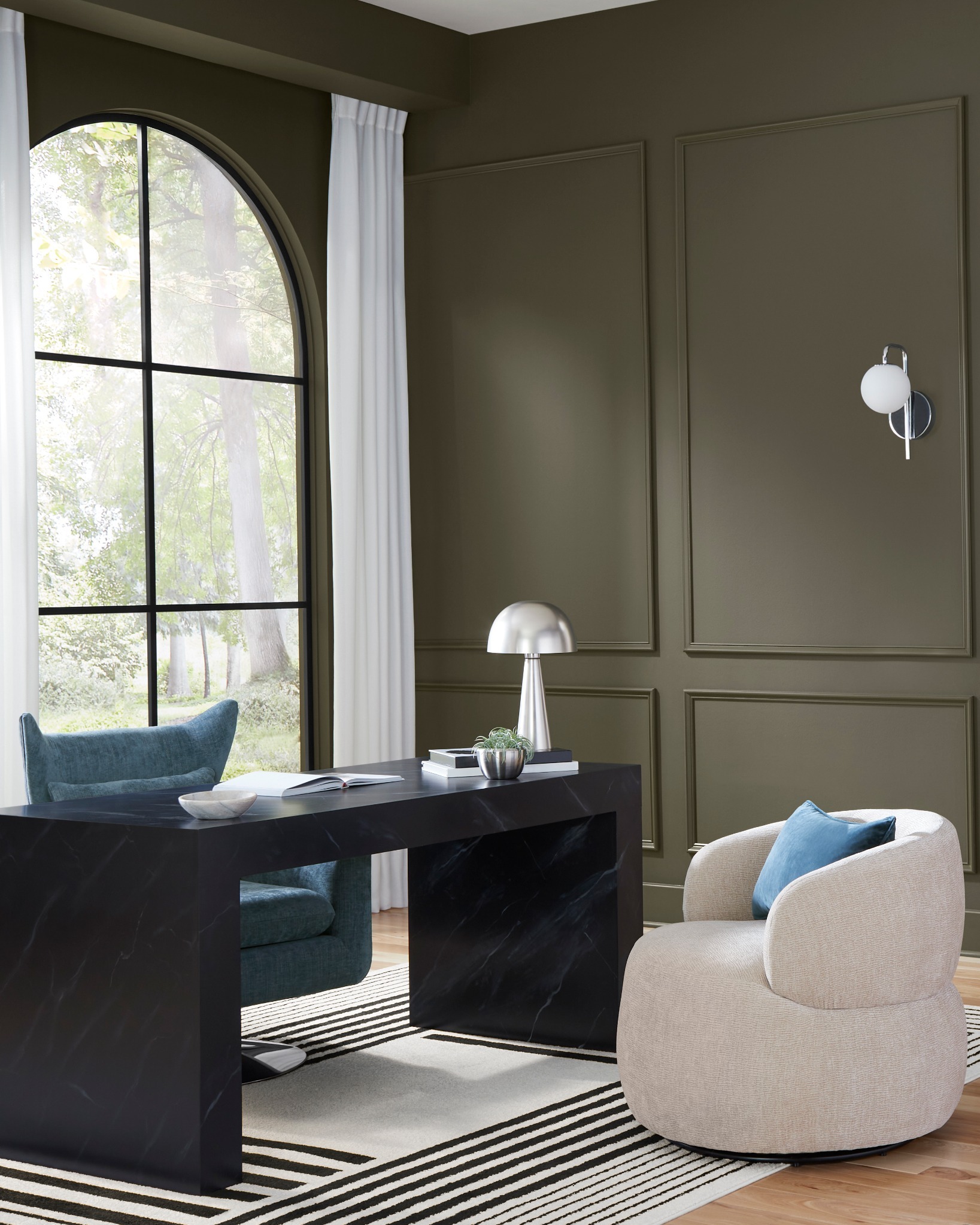
Do: Start with your favorite color. “For an all-over room color, choose a muted version of your favorite hue,” Doornink says. “For an accent wall, choose aversion of the color that achieves your desired feeling (ie: peace and calm, moodiness, energy, etc.). A good rule of thumb is 60/30/10: 60% main color, 30% coordinating color, and 10% accent color.”
Don’t: Select paint colors before seeing them in your space. “One of the most common mistakes we see [when people are selecting paint colors] is homeowners not viewing them in their own space,” Stallings says. “Colors will look different in your home than they do in a store, a friend’s home, or a Parade home. Use those colors as inspiration, but confirm you love it before committing.”
Do: Start small—both figuratively and literally. “Wallpaper is one of the most approachable ways to introduce color and pattern without feeling like a huge commitment, especially in a smaller space like a powder room or entryway,” Campbell says.“You’re working with limited square footage, so the impact is big, but the investment feels manageable.”
Don’t: Limit yourself. “There are so many places to add color in your home, including ceilings and furniture,” Doornink says. “Flipping the script and painting woodwork a color that is vivid or darker than the walls feels vintage and fresh at the same time. Painting interior doors a complementary or analogous color adds some punch. It’s just paint—you can always repaint as needed.”