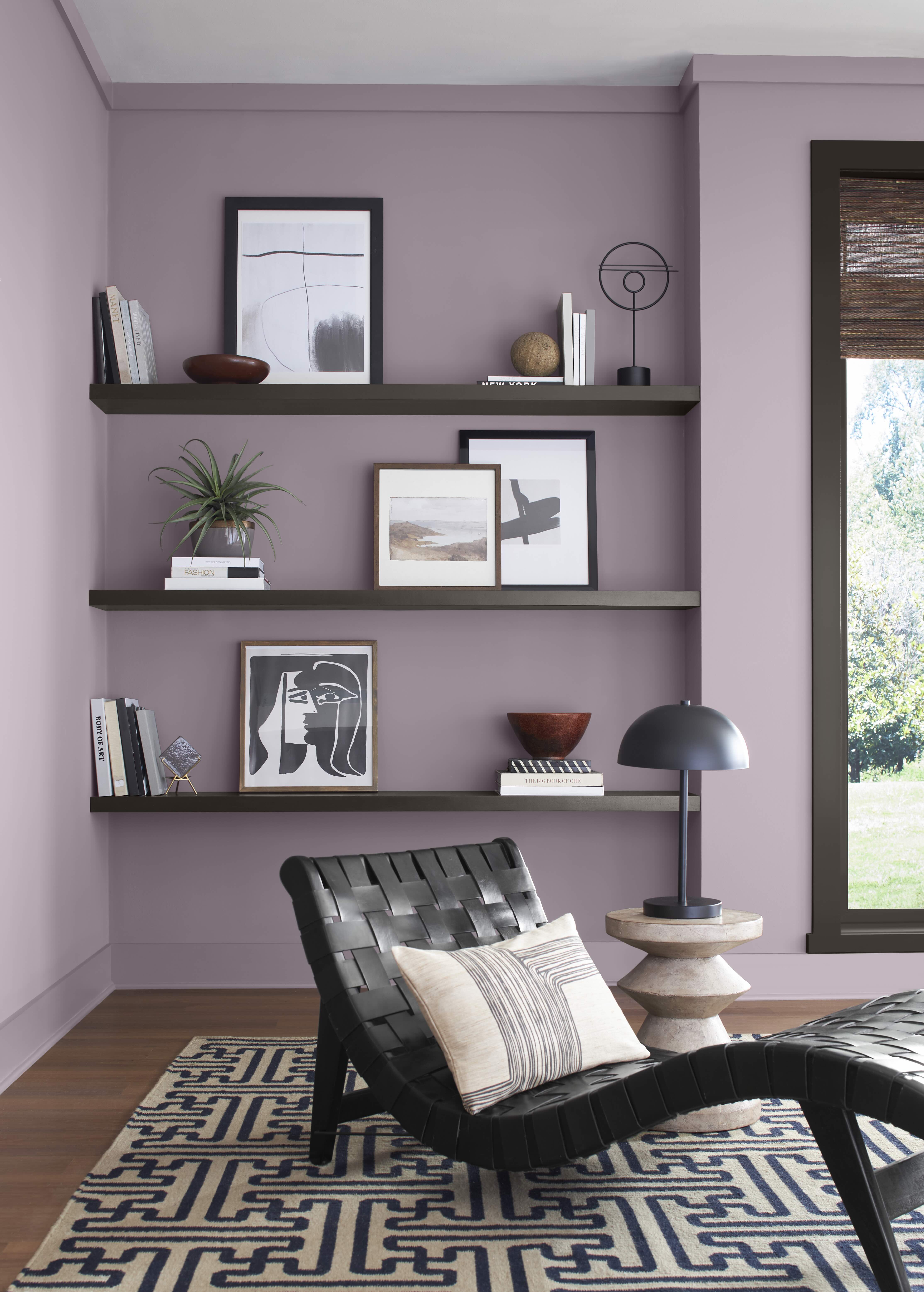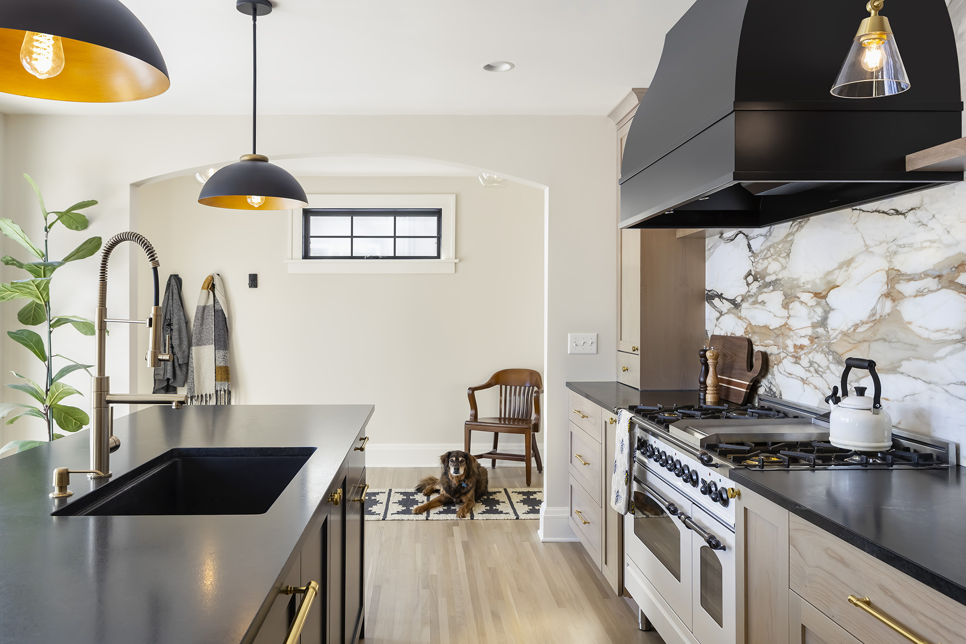

When it comes to designing a home that fosters health, happiness, and wellbeing, color is one of the most powerful tools at your disposal. The colors we choose for our walls influence how we feel, think, and interact in our spaces. By tapping into the principles of color psychology, you can curate a home that nurtures calmness, sparks energy, or inspires joy.
“Choose colors based on the mood you want to evoke,” says Jean Haukaas, Hirshfield’s Design Resource showroom manager. “Calm, neutral tones like soft blues and grays work well in bedrooms, while brighter, more energetic hues can suit kitchens or playrooms.”

Bedrooms and bathrooms are sanctuaries where calmness and relaxation should reign. Soft, cool hues such as blues, greens, and neutrals pair beautifully with natural textures and soft lighting to create an inviting retreat that feels like an escape from the busyness of life.
“Upward SW 6239, a light and airy blue that breathes a calming breath of fresh air into any space, is a great choice for bedrooms and bathrooms where homeowners are looking for a restful retreat,” Emily Kantz, color marketing manager with Sherwin Williams. “I’ve also been loving the idea of restorative darks, so I would also recommend going for a deep and warm brown tone such as Clove SW 9605 from our 2025 Color Capsule of the Year. This shade is the perfect balance between elegant and restful thanks to its warmth that helps ground any room.”
Expert Picks

For areas of the home where energy and creativity are needed, brighter, warmer paint colors take the spotlight. Pair these hues with neutral tones to maintain balance while still fostering vibrancy.
“Using a palette with a soft touch of yellow, like Hirshfield’s Barberry Sand or Benjamin Moore’s Acadia White, can make the space feel lively and invigorating, adding warmth and a sense of energy without overwhelming the senses,” says Haukaas.
Expert Picks

Living rooms and playrooms are spaces where connection, fun, and joy come to life. Bright, cheerful paint colors can infuse these areas with an uplifting vibe. These hues work well with playful patterns or statement artwork to enhance the room’s joyful atmosphere without feeling chaotic.
“Hirshfield’s Sandstone Palette provides the perfect backdrop for adding colorful furniture and accessories, creating a welcoming space where family and friends can gather and enjoy,” shares Haukaas.
“I’m currently loving two playful and colorful shades from our 2025 Color Capsule of the Year: Chartreuse and Mauve Finery,” says Kantz. “Chartreuse is a historic color that has never been more relevant. This vibrant yellow green has appeared on three of our most recent Colormix Forecasts and brings a jolt of joyful, tropical brightness that is both effortlessly eclectic and surprisingly versatile. Mauve Finery brings a touch of botanical beauty to any space. This subdued, sophisticated true mauve, with a dreamy quality that adorns spaces with a refreshing appeal as a wall color or an accent hue.”
Expert Picks

Neutrals are the unsung heroes of color psychology. They provide a versatile canvas that allows accent colors to shine while promoting balance and grounding energy in any room.
“We’ve noticed homeowners are now gravitating towards warmer toned neutrals, such as beige, brown, or warm whites, instead of grays and cool whites,” says Kantz.
Neutrals are especially effective in open-concept designs, where cohesion and flow are essential. Add dimension to your neutral base by selecting paint colors with varied undertones to create subtle depth.
“These tried and true colors work for everyone,” adds Haukaas. “There’s a reason they’ve been around for a long time.”
Expert Picks
.jpeg)

When it comes to remodeling your home, who you choose to work with matters just as much as what you plan to change. A great remodeler will guide you through a complex process with expertise, transparency, and professionalism. And in a world of DIY shows and social media inspiration, it can be tempting to cut corners or rush the hiring process. But a remodel is a major investment in your home — and your peace of mind depends on getting it right from the start.
So, what does hiring a professional remodeler actually look like?

Choosing the right paint color for your home can be overwhelming. With endless shades and finishes available, it’s easy to make mistakes that lead to regret later. Here, Jean Haukaas, Hirshfield's Design Resource Showroom manager, shares some of the most common paint color mistakes homeowners make — and how to avoid them.

Older homes are desirable for their historic charm and established neighborhoods, but when it comes to amenities that promote health and overall wellbeing, your 1930s Tudor may be lacking. Through strategic remodeling, these older homes can be updated to meet contemporary wellness needs, whether it’s more windows to increase natural light, a reimagined kitchen that encourages cooking balanced meals, or smart features that make day-to-day life
a little easier.